
Grailed
Deliverables: Grailed Payments UX and UI, all payments-related surfaces on the iOS mobile app and website
Role: Product Designer on the Payments Squad, 2022-2023
Intro: Grailed was known to be the largest organically-grown marketplace for men’s luxury secondhand goods. Grailed's community is committed to sourcing and returns repeatedly for niche high-quality pieces that can only be found on Grailed. In 2022, Grailed expanded their payment options to include a new program — Grailed Payments, got acquired by GOAT, and re-entered the womenswear space.
The Challenge
Grailed had the desire to reach industry standards and differentiate our product from competitors via the Grailed Payments program. On the surface, this program aimed to provide multiple payment options to our users for the first time in 9 years and a better user experience for all, but for the business, it also increased our revenue and mitigated risk, fraud, customer experience complaints, and more. We previously had only offered PayPal, which led to sellers losing claims and getting blocked, high fees for the business, the inability to offer our own shipping labels, and more severe problems. The Payments Squad was formed to handle integrating more payment options such as credit cards, Apple Pay, and Klarna, and updating any payments-related factors such as: international taxes, internal tools for customer experience, FAQ pages, card management system, updating binding offer and refund flows, monitoring risks, and data analytics. In our first year, we saw our user preference for Grailed Payment options grow to 75%, and chargeback rates reduce by 3.05%.
As the designated Product Designer, I was focused on mapping the above business and user concerns into an iterative vision for Grailed Payments. Along the way, I created new Design System paradigms and UI improvements that reduced cognitive load, and managed communications and expectations with cross-functioning teams such as stakeholders, payment operations, data analytics, marketing, customer experience, product, and engineering.
Payments squad, year in review
iOS Designs and Experiments
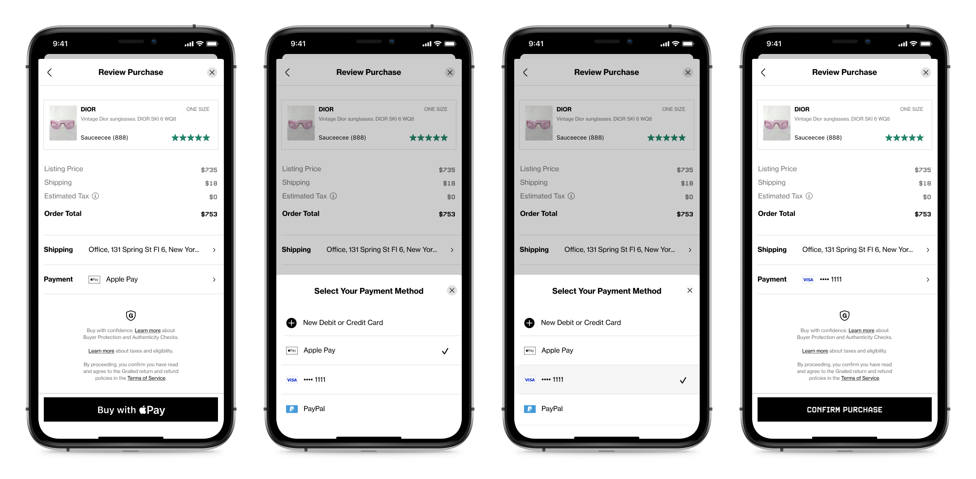
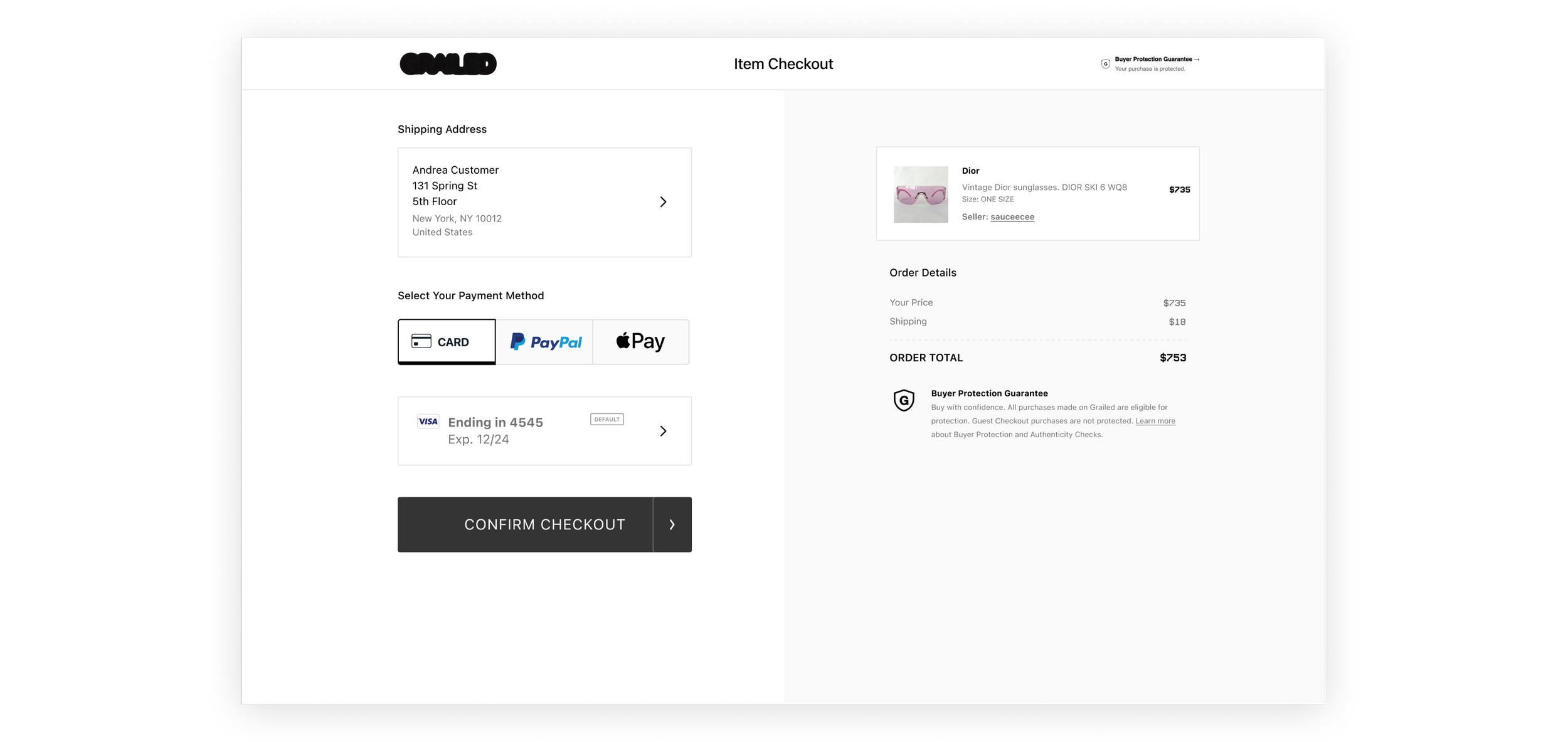
The payment flow needed a complete redesign, and a flexible way to house multiple payment options according to the buyer's location, sellers' GP status, and more. We created and tested multiple versions of our new payment flow for iOS and desktop web, ultimately settling on a payment selector bottom drawer for iOS, and a one-click payment grid on desktop web. We also created a card management system now that our buyers could have multiple saved cards, and updated relevant surfaces to advertise our new payment methods. The following designs depict the screens from the buyer journey that I made.
Flexible iOS Payment Selector
Many iterations funneled into this final design. Although the Review Order screen received the biggest UI makeover, the payment selector brought the most UX challenges. Some of the considerations and features of this design are:
Flexibility: Allows re-ordering and differing numbers of payment methods. The buyer's and seller's location determine international and state taxes, and the payment types available. I worked with the backend engineers to form a hierarchy of methods shown to skew towards GP methods and to raise the last used card to the top of the card section.
New Design System improvements: I introduced new icons, list screen, and bottom sheet pagination paradigms to our Design System. The pagination and localization of all payment decisions within this bottom sheet paradigm reduced cognitive load.
Efficient UX/UI: This bottom sheet paradigm reduced clicks, introduced animations, and could resize to various heights.
The payment selector added a new selection animation paradigm and is variable in height

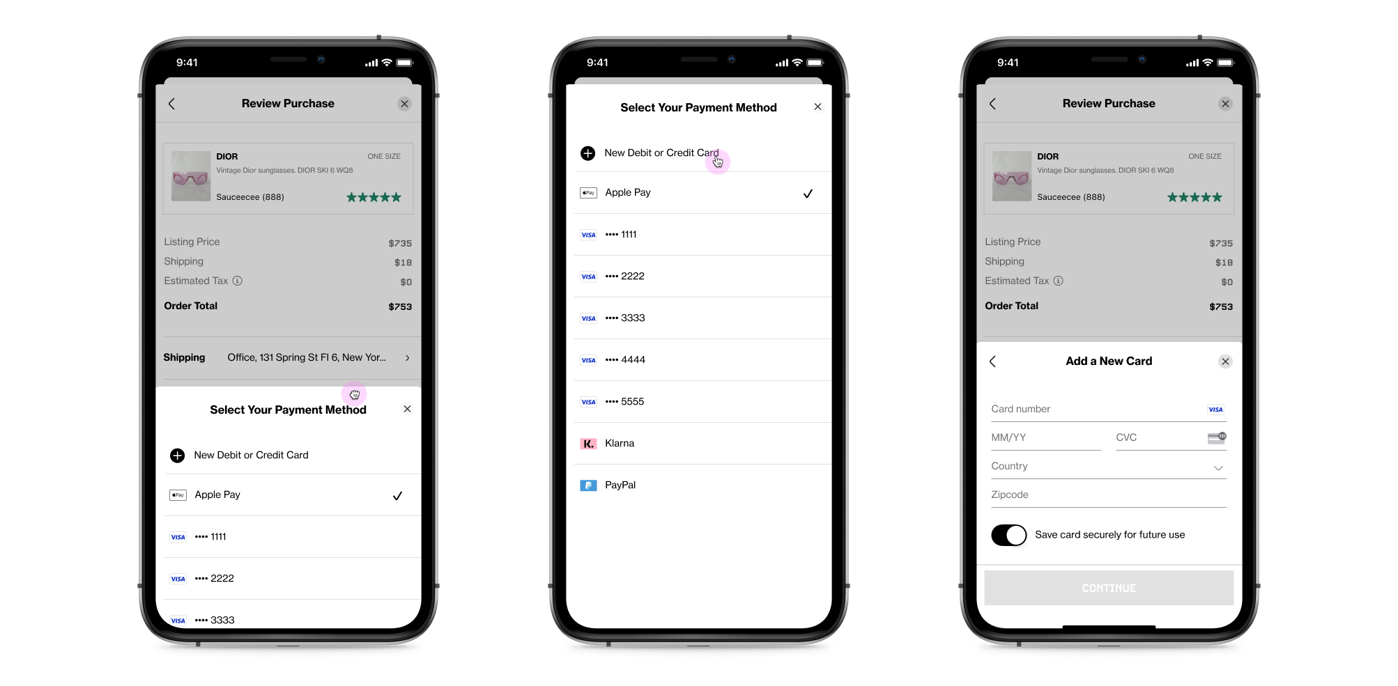
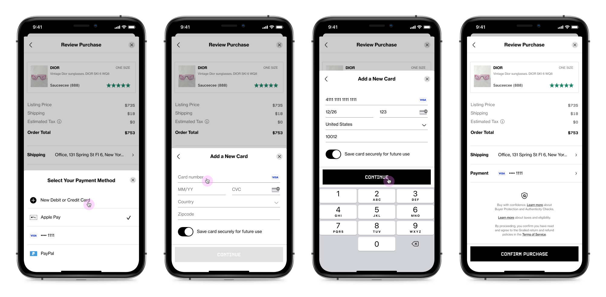
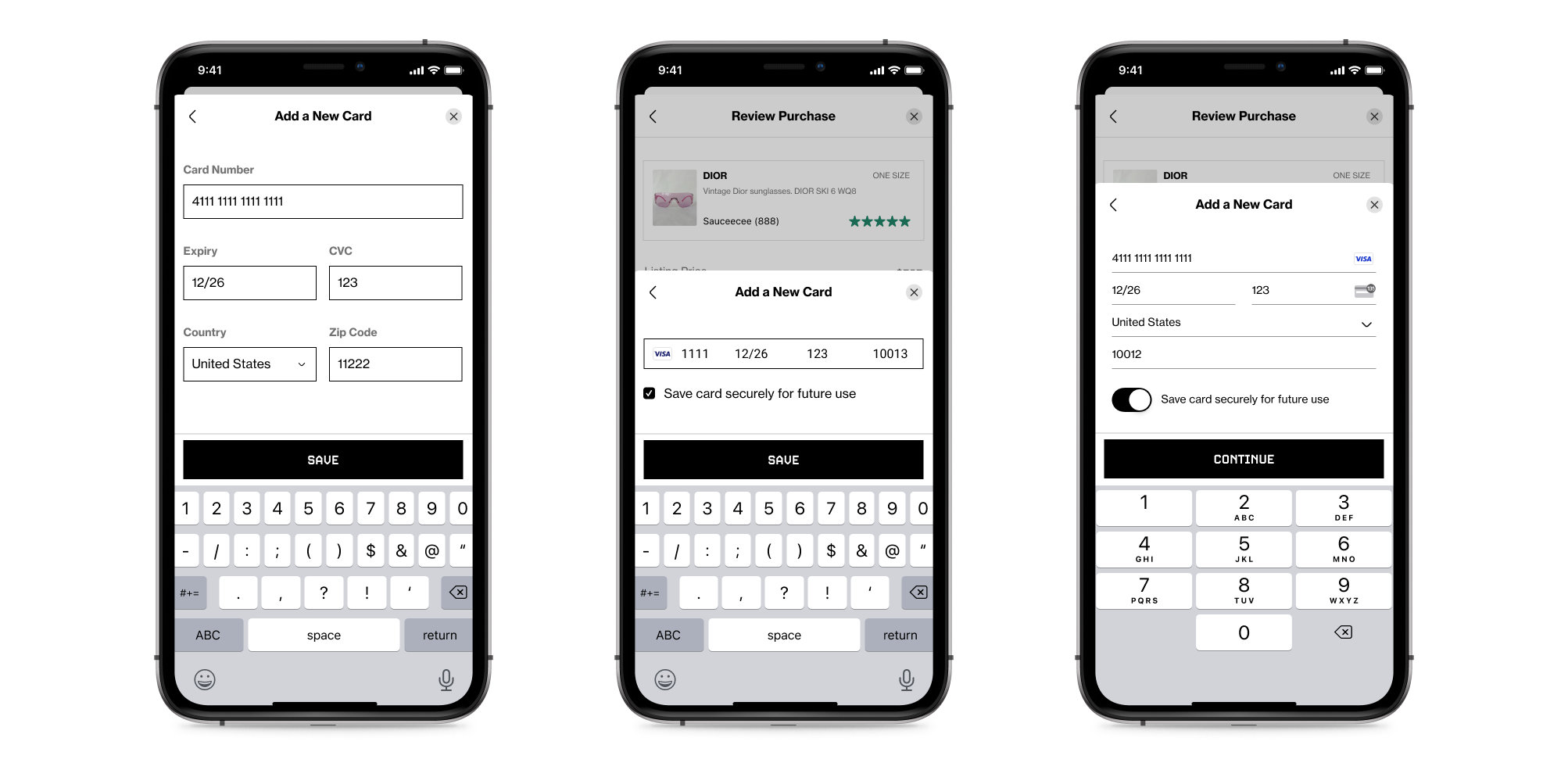
Add New Card Screen
We researched and iterated many times to land on this stripe-provided form. We started with a highly-customizable one-liner form that allowed us to scan cards and included built-in error states and card validation. Eventually, we found a bug that required us to switch over to a multi-line form that ultimately served as inspiration to update our form fields in our design system, while maintaining the same former validation abilities. The scan card feature was another fun project where I was able to learn about engineering limitations, and provide an elegant, custom design that fit our user and backend needs.
The Final multi-line stripe form flow, the evolution of the design, and the custom scan card feature

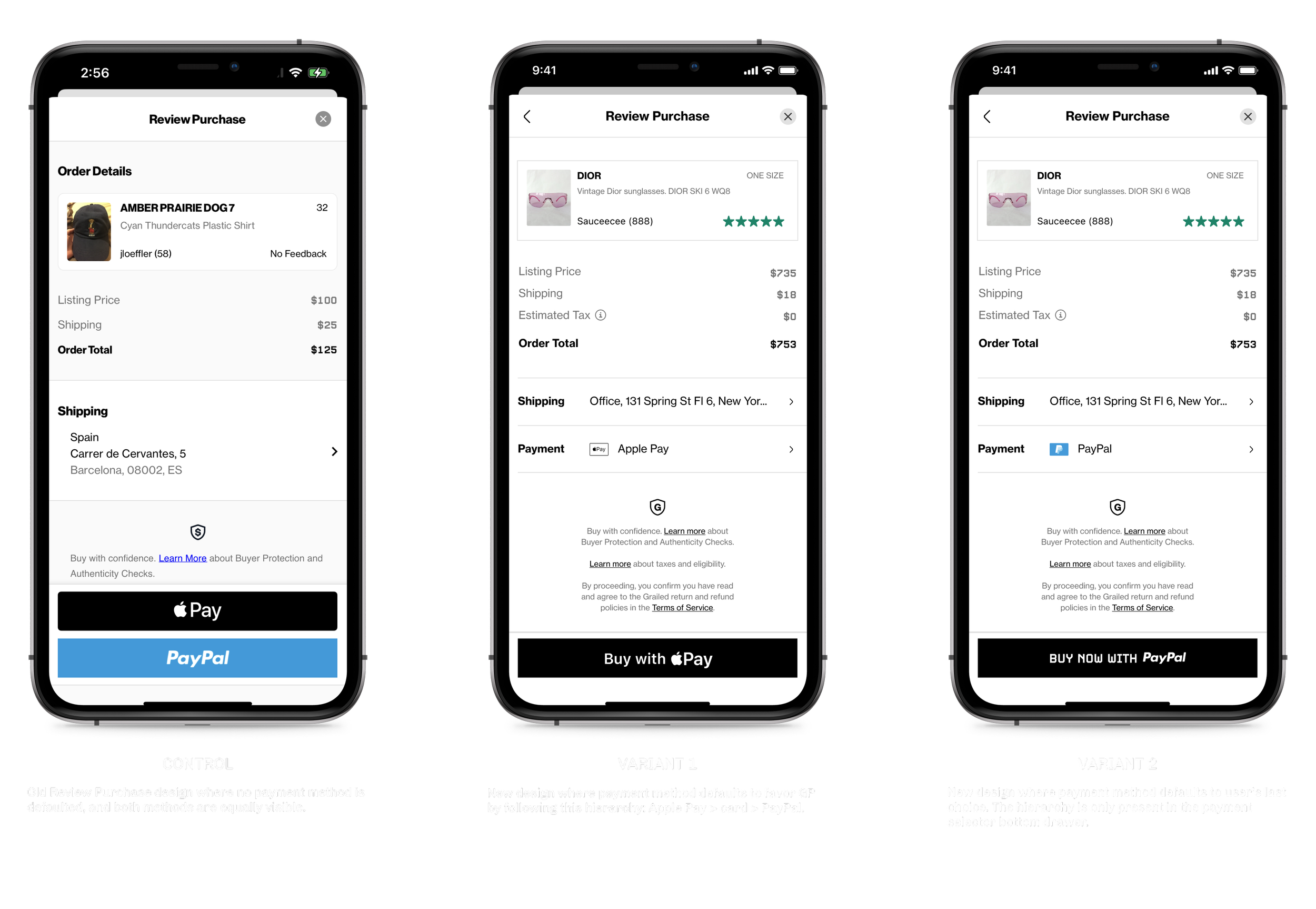
Default Payment Method Experiment on iOS
The new Review Purchase design is set up to pre-populate with a payment method so the user can quickly scan the page and complete their purchase without refilling out the form every time. When I first came up with the pre-population idea, two forks emerged. We could either default to the last used payment method, thus favoring the user experience, or we could default to a GP method, thus favoring the business OKR to increase Gross Merchandise Volume (GMV) through GP methods. We decided to run an experiment to let our users inform us of which direction to go in.
Goal: Do no harm to the checkout completion rate or offer completion rate by changing payment selection on iOS to a new selector method. Measure if defaulting to a GP method or the user’s last-used choice would have higher conversion rates.
Process: I worked with the data analytics and engineering team to instrument orders and offers viewed and completed, and which payment method was chosen for each. The control and variant designs are illustrated below along with our primary and secondary metrics. We ran this experiment for 2 weeks.
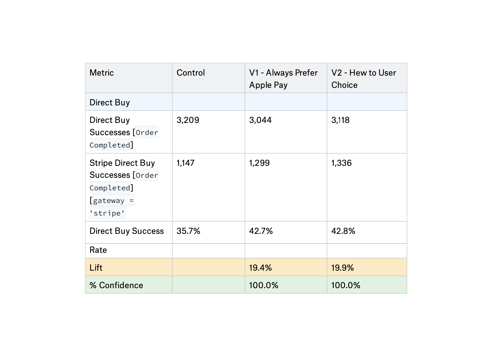
Results: The results point to this experiment doing no harm regardless of variant, with no significance found between variants for primary metrics. However, there is one area of significance, which is that Variant 2 saw a significant lift compared to the control for the offer flow, specifically when Apple Pay is an option. On Payment Preference, both variants showed a significant lift in preference for Stripe, with Variant 2 slightly edging out the other variant.
Conclusion: Thankfully, the new design wasn’t confusing for our users so we could safely implement it. We chose to go with Variant 1, which defaults to the GP hierarchy to meet our business needs better. Months later down the line, we had to pause our GP program while we recovered from some risks, and when we turned it back on, the user preference rose right back up to preferring GP 75% of the time in a week, so ultimately, defaulting to GP was the right decision.


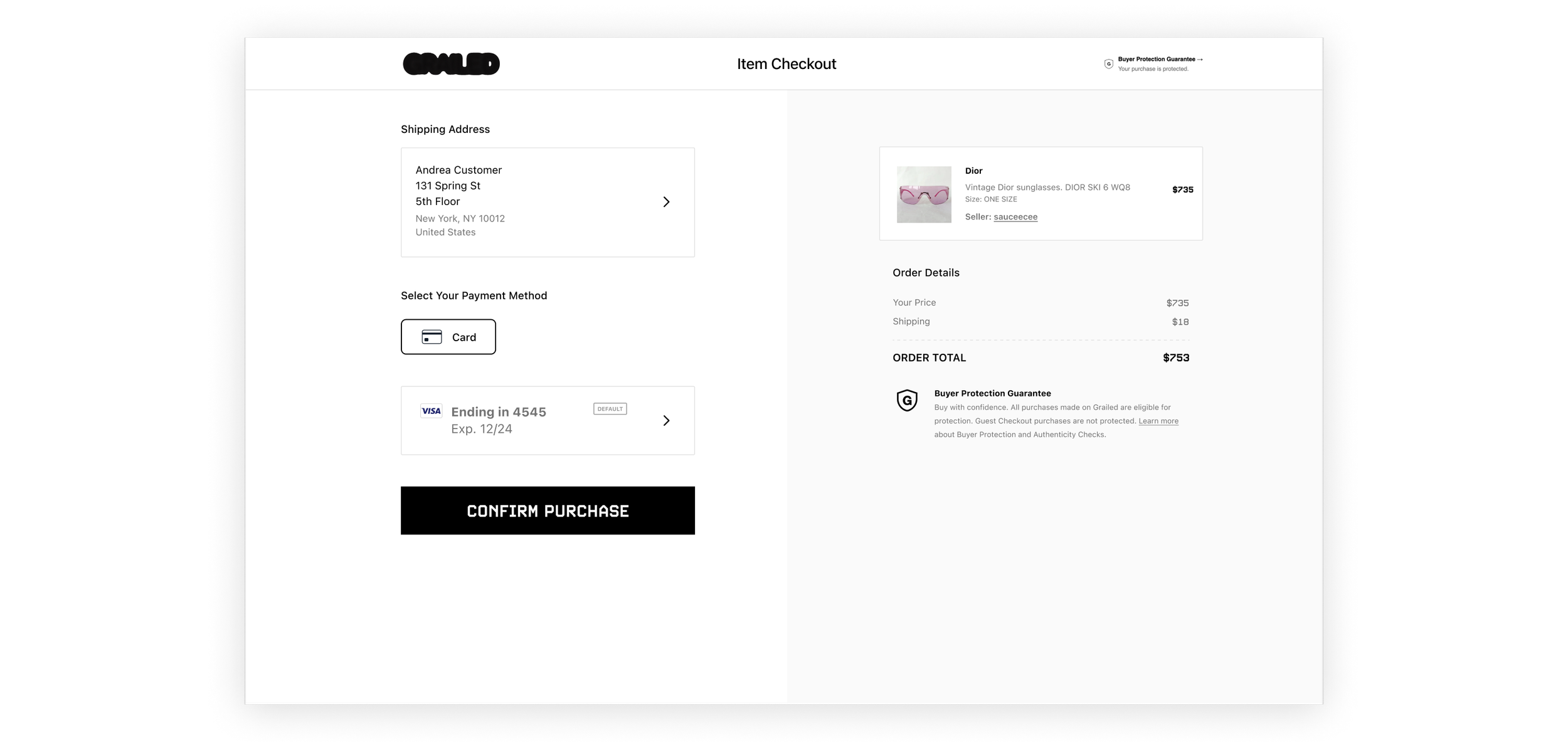
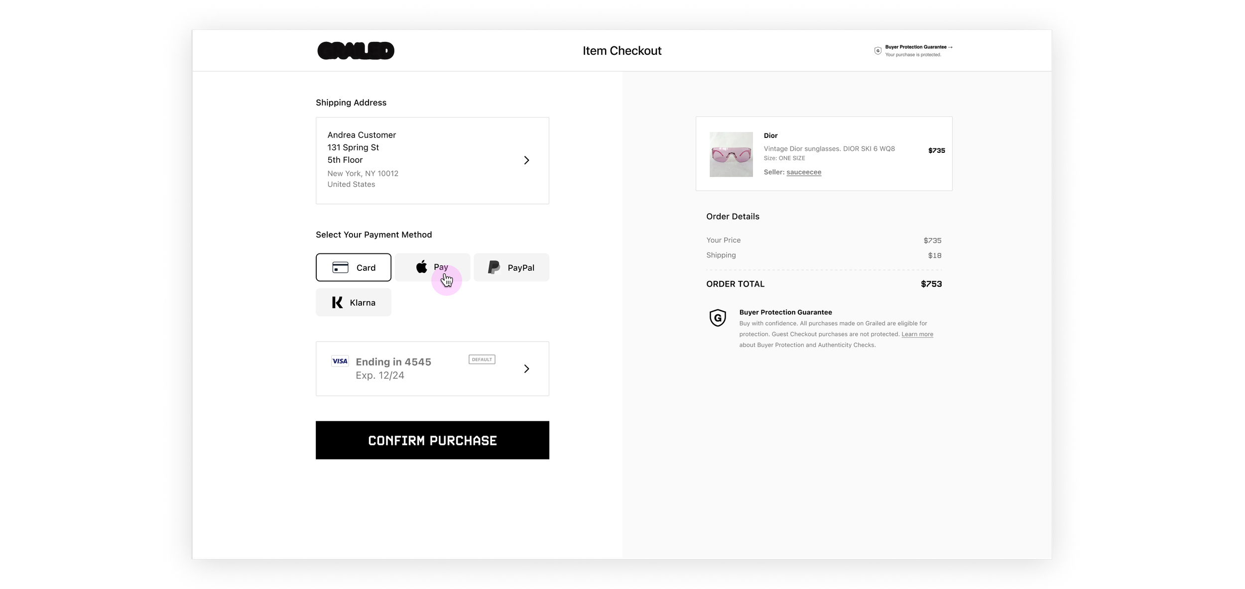
Desktop Web Payment Grid
This grid --like its iOS sibling-- would only populate with the available payment options according to the buyer's and seller's eligibility instead of showing disabled payment methods. The grid had to appear visually balanced whether just one or all six payment methods were available. I opted for a one-click mechanism where the user can immediately enter the designated payment experience directly from the grid and thus not leave the payment flow. Lastly, I had to standardize the various branding assets on each button while prioritizing the payment methods according to our hierarchy that skewed towards GP methods. In the interest of time, we only made light changes to the Select A Card and Add New Card screens on desktop web.
Any number of payment methods can populate this grid from 1 to 3 to 6 payment methods


One click takes the user to the payment experience selected and keeps them within the payment flow


Evolution of the payment tabset to flexible grid

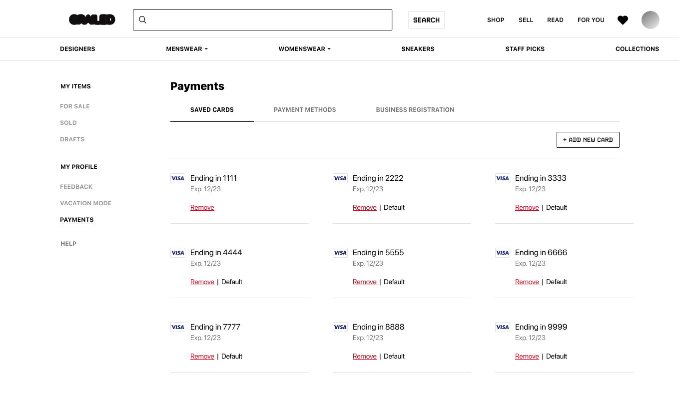
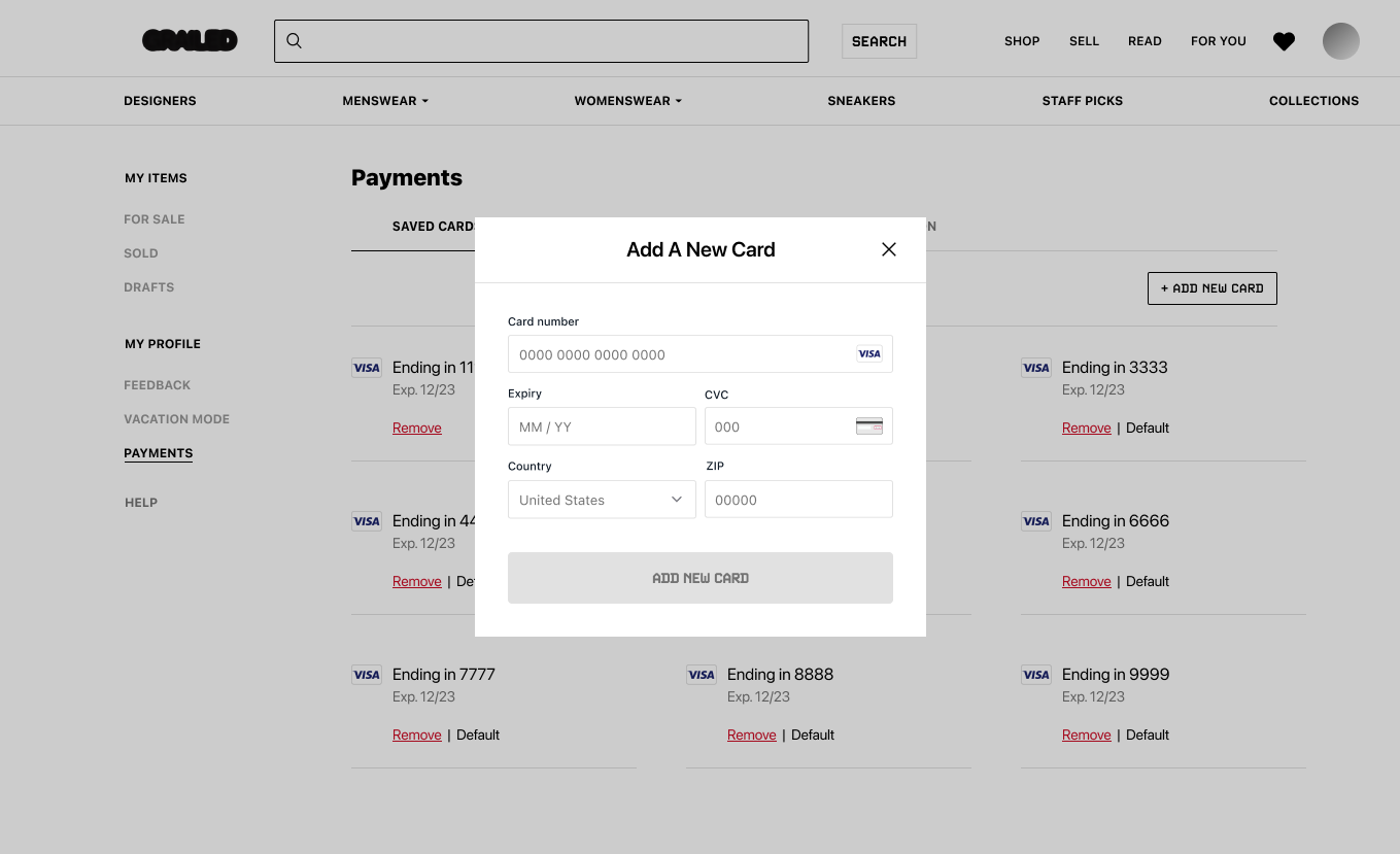
card management
When we offered the ability to add multiple cards during the payment flow, we had to address card management as well. Our users sometimes use one-time use prepaid cards, so it was possible that this list would get hefty, or users simply had cards expire and needed to get rid of them. With our heavy time constraints, we opted to work on this on desktop web only. I designed a new page to delete cards and select a card as the default card, meaning it would show at the top of the list of cards during the next payment. I borrowed elements from the card component from the existing payment flow as to reduce engineering effort.
Saved card management page featuring the remove card alert and re-usable add new card modal component

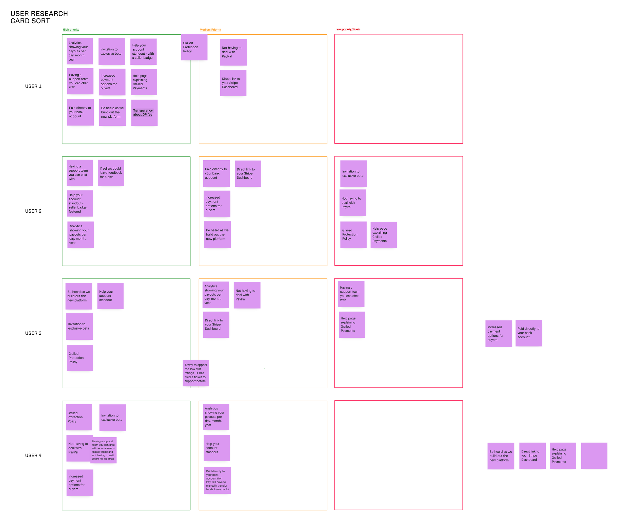
Artifacts
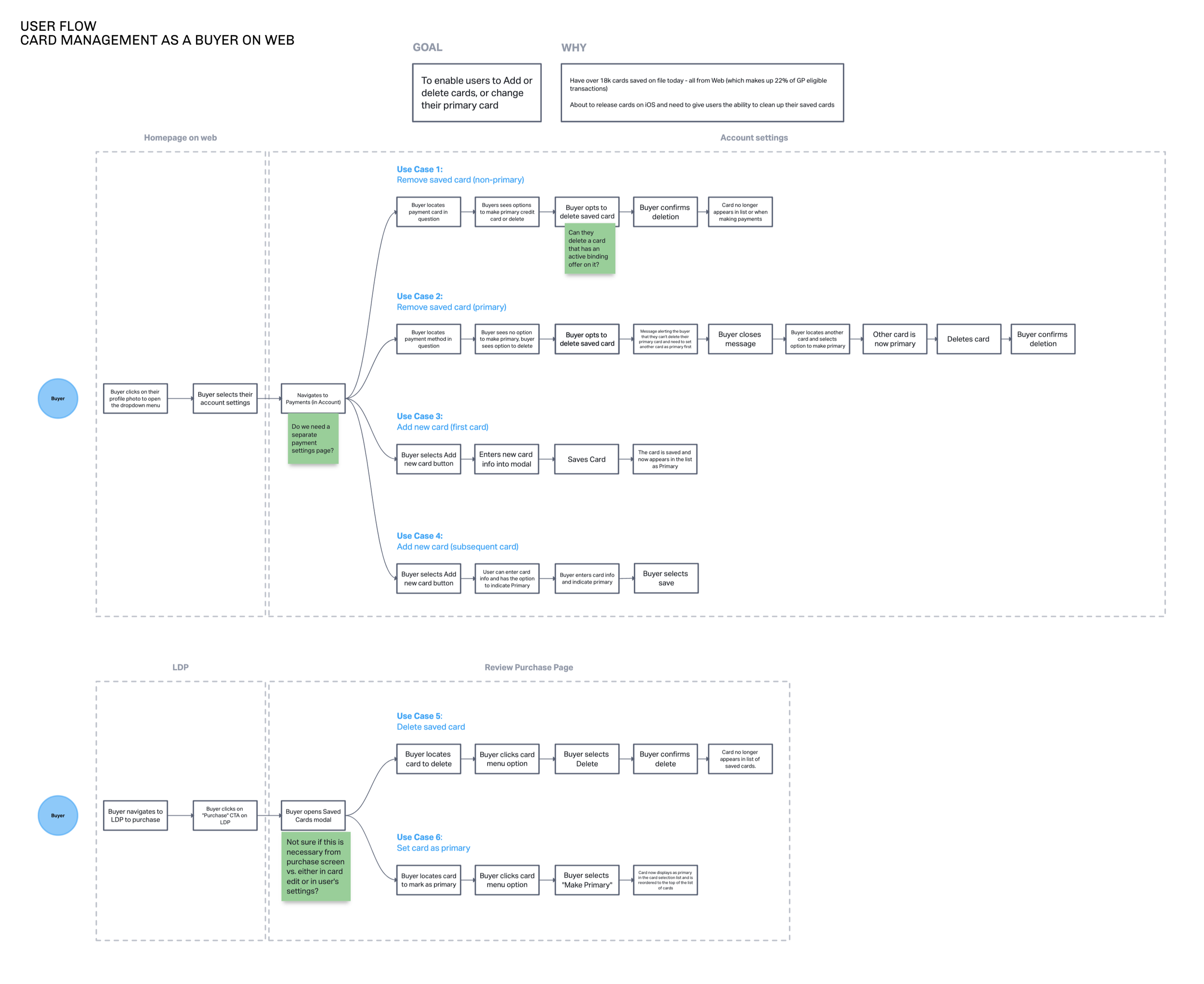
The following artifacts show some of the behind-the-scenes user flows, story maps, opportunity solution trees, competitive audits, user research, and marketing collateral I have created over my time on the Payments Squad.


In Conclusion
My experience at Grailed bolstered my design portfolio and vertical industry exposure with a team that had the resources my previous companies did not. It was a very rewarding experience to run experiments with instrumentation from data analytics, hold design and product crits every week, and conduct user research from a diverse customer base. Working cross-functionally to get my squad's projects off the ground while making sure our projects didn't clash with other squad's experiments on the same screens was appropriately challenging and refreshing. My design mind and heart will always be touched by working with some of the smartest and wittiest people.